Kakeibo - Mindful Budgeting Made Simple
My Contributions
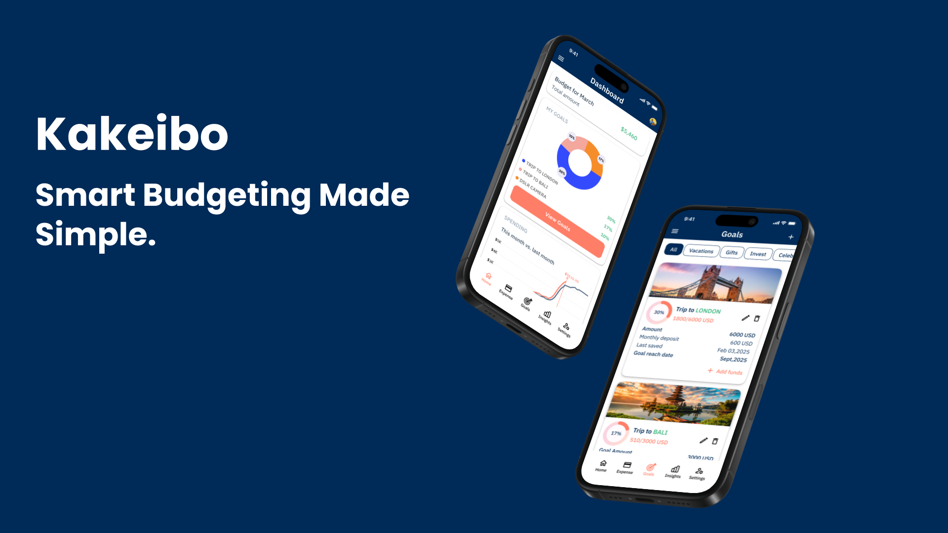
Kakeibo
An app to manage your spending, set budget goals, and meet them.
Kakeibo is a simple, intuitive budget management app designed to help individuals and families track expenses and set meaningful savings goals.
With a clean, minimal interface, Kakeibo enables users to effortlessly create and manage budgets, save for specific goals, and monitor financial health—all in one app.
Our users wanted an easy, straightforward solution for managing finances, and Kakeibo delivers just that, making budgeting accessible for everyone.
PROBLEM & GOAL
Problem: For many people, managing finances—especially saving up for specific goals like a vacation or an emergency fund—feels overwhelming. They often resort to multiple tools: spreadsheets, various budgeting apps, and even pen-and-paper methods. But these options can feel complicated, time-consuming, or even require a subscription fee, adding another burden to their finances.
Goal: The goal of Kakeibo is to create a user-friendly, accessible platform that simplifies budgeting and saving for individual and family goals. We aim to provide a streamlined, cost-effective tool that eliminates the complexity of traditional budgeting methods, making it easier for users to manage their finances, track spending, and reach their savings goals all in one place.
UNDERSTANDING THE USER
Research
Before designing anything, I needed to step into users’ shoes and truly understand their struggles with budgeting and saving. I listened.
So, in the empathize stage, I conducted individual user interviews. I started with an online form containing questions of two types: long questions, multiple choice questions. These questions were of quantitative and qualitative nature.
And then I performed one-on-one followup interviews (video calls, in person) with all participants.
- Do you currently save up for shared goals (e.g. vacation)?
- How do you manage group savings?
- What features would make a budgeting app most useful to you?
- If you’ve used a budgeting app before, what do you like or dislike about it?
User Research Summary
Varied Budgeting Methods: Some users rely on color-coded spreadsheets, while others avoid tracking finances altogether.
Saving Goals are hard: Most users expressed difficulty and setting saving goals and keeping up with them.
Key Discovery: While some users face these issues, others find existing apps frustrating due to limited tracking features or excessive notifications.
Refined Priorities: Shifted focus to ease of use, transparency, and real-time expense tracking for better user experience.
Budgeting isn’t just math—it’s emotional. People shared their stress over unexpected expenses, the guilt of overspending, and the excitement of hitting a savings goal 🎯.
Empathy Mapping

Understanding the User
To deeply understand user needs, I conducted surveys and interviews to uncover common budgeting challenges. I synthesized the insights to build two user personas and crafted user stories and journey maps to visualize their pain points and motivations.
This process helped me identify key opportunities, such as:
Adding a shared wallet for tracking group expenses
Designing goal-setting visuals to motivate users
Implementing reminder systems for consistent budgeting
These insights shaped the core experience of the app and ensured every design decision was user-centered, reducing bias and enhancing usability.
Personas

DEFINE
User Story
Problem Statement: Elliot is a busy Sales Manager with family who needs a unified budgeting app which provides clear financial insights, so he can effectively track his spending, save for family vacations and manage future expenses because he struggles to manage his personal and shared expenses effectively; and lacks clarity on how to start saving for his goals.
Hypothesis Statement: If Elliot uses an app which allows him and his family to set saving goals, view spending and add expenses then, he can effectively manage budget without juggling between different apps.
User Journey Map
Persona: Elliot
Goal: To effectively manage his finances and save enough for family vacations and future expenses.
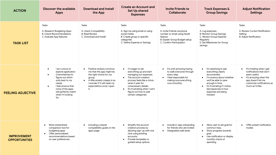
User Research: Pain Points
1. Onboarding confusion: Users don’t know how much to save each month to reach their goal.
2. Manual Expense Splitting: Many users dislike the manual process of splitting expenses after a payment, which can be time-consuming and prone to errors.
3. Difficulty Tracking Group Savings: Users struggle with managing and tracking group savings goals, finding it hard to monitor progress toward shared financial objectives.
4. Experience: Users need a seamless and intuitive experience when saving for a common goal or tracking expenses.
Understanding the Competition
I conducted extensive competitor research, examining both direct and indirect competitors’ apps, analyzing their visuals, interactions, and content, and determining what made them stand out. More importantly, I paid close attention to what wasn’t working and where users might struggle.
This process wasn’t just about comparison; it was about learning. It helped me:
- Shape my design decisions based on real insights, not assumptions.
- Spot usability issues that I could improve on.
- Find gaps in the market—features or experiences users needed but weren’t getting.
- Save time by avoiding mistakes others have already made.
- Back up my design choices with actual data instead of just a gut feeling.
By the end of this audit, I didn’t just have a list of what competitors were doing—I had a clear direction for making something better, more user-friendly, and genuinely helpful.


HMW’s
How might we turn financial setbacks into opportunities for users to stay motivated and adjust their goals?
How might we simplify budgeting so that users feel less overwhelmed and more in control of their finances?
How might we make saving money feel more rewarding and engaging for users?
Crazy Eights
Ideas generated from Crazy Eights

Seamless Expense & Goal Management – The app should make adding expenses and savings goals effortless while maintaining a visually appealing interface.
Clear & Concise Homepage – The homepage should provide a brief yet comprehensive overview of the app’s features, ensuring users quickly understand its value.
Intuitive & Enjoyable Experience – The design should be user-friendly and engaging, making financial management feel simple and rewarding. 😊
Storyboards
I created both big-picture and close-up storyboards to understand the user journey and key interactions within my app. The big-picture storyboard helped me see how and why users engage with the app in their daily lives, while the close-up storyboard focused on specific interactions to identify usability pain points.

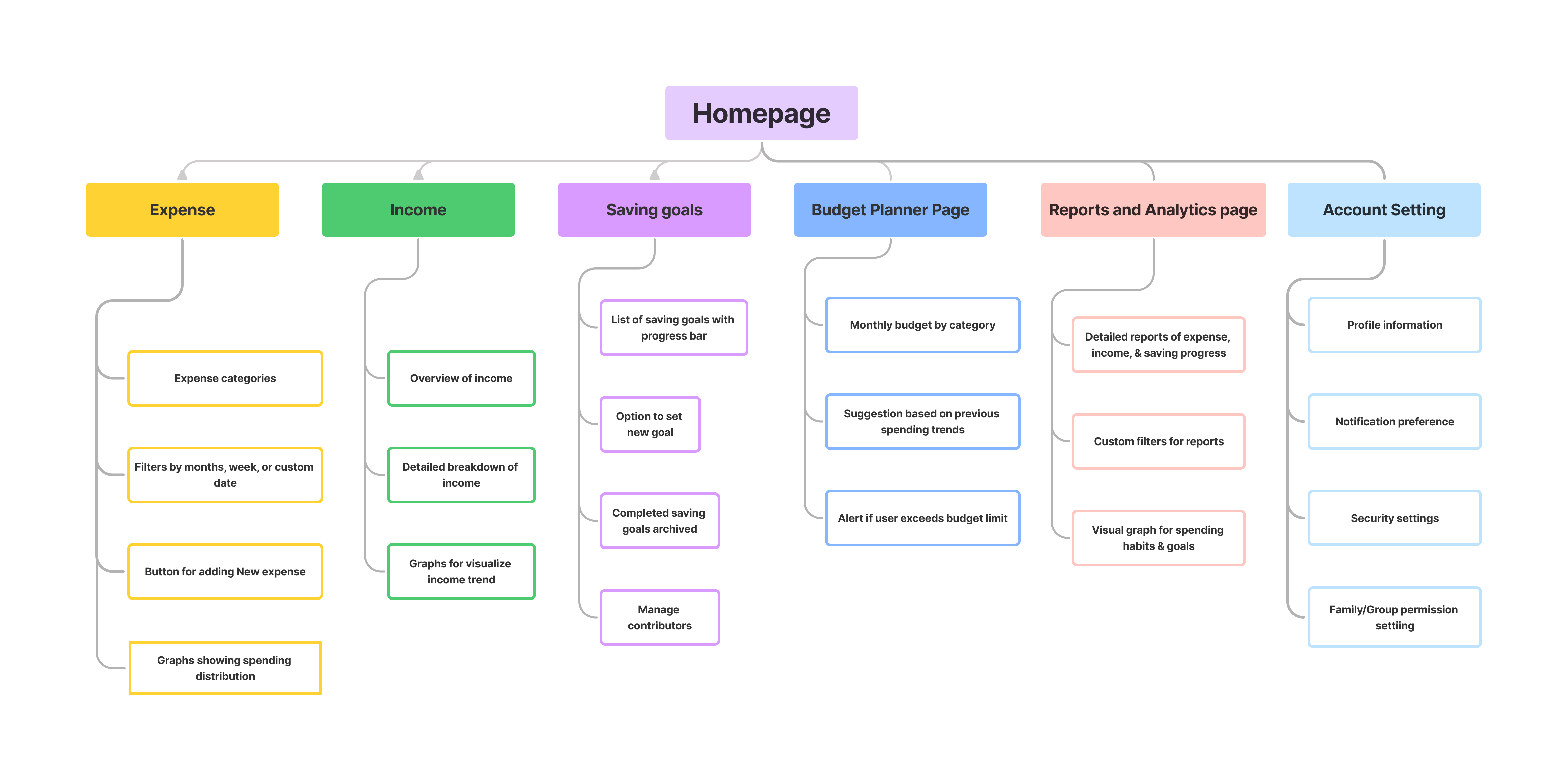
Site architecture
I designed the site architecture with clarity and simplicity in mind—mapping out a structure that feels intuitive and easy to navigate. Each section, from the dashboard to the shared wallet and goal tracker, was thoughtfully placed to guide users smoothly through their budgeting journey.
Starting the design
I began the design process by sketching out initial ideas through wireframes, followed by low-fidelity wireframes and a clickable lo-fi prototype. This helped me visualize the core structure, test early user flows, and quickly iterate on layout decisions before moving into high-fidelity design. It set the foundation for a user-friendly and goal-focused experience.
Paper & Digital Wireframes
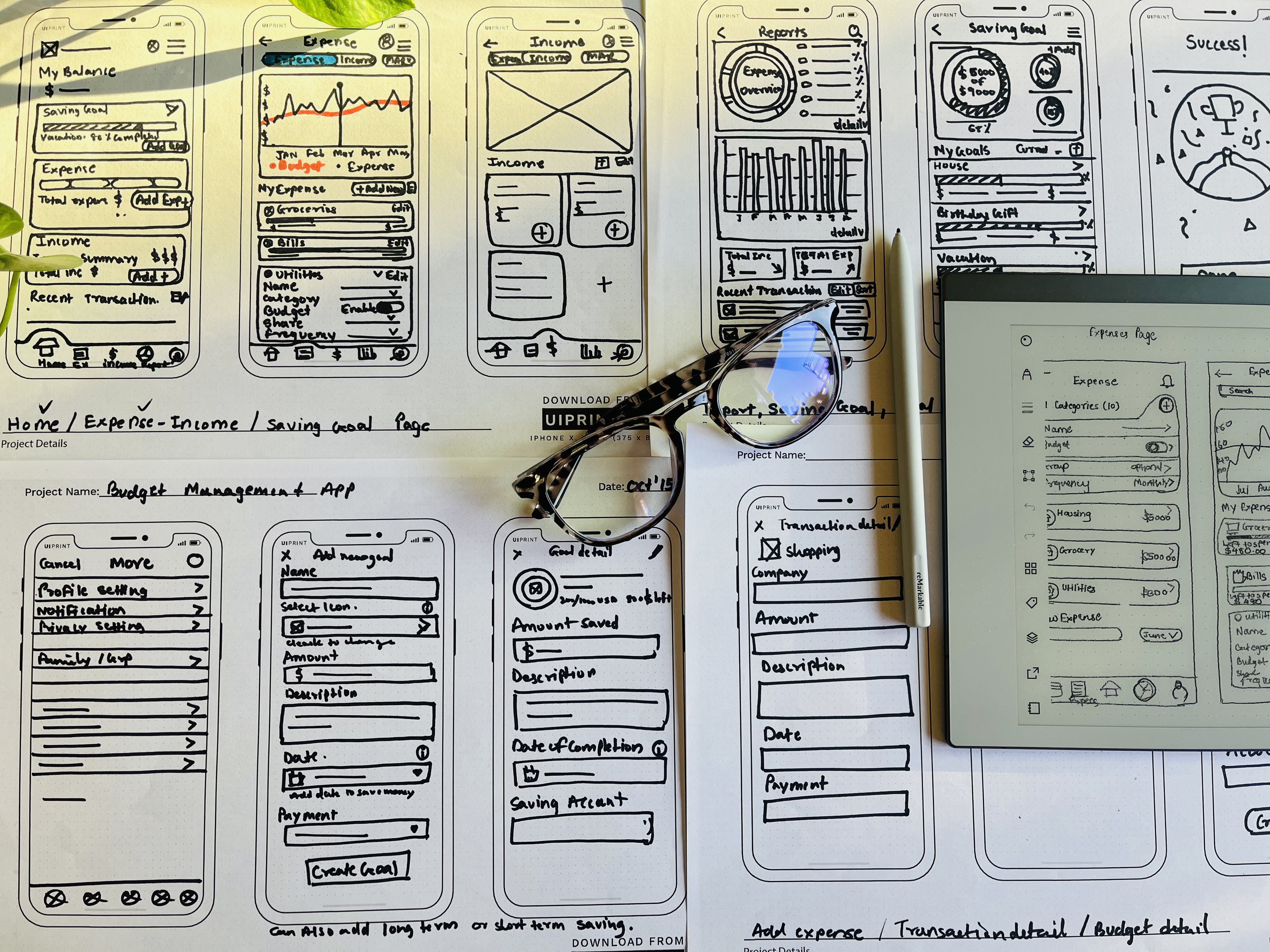
Low Fidelity Wireframe & Prototype
I developed low-fidelity wireframes and linked all the screens to create a prototype. At this stage, I gathered feedback on the user flow, button placements, input field details, and card design. I actively listened to the feedback and made revisions based on suggestions that addressed key user pain points, ensuring a smoother and more intuitive user experience.


Usability Study
My goal for this research study was to understand user needs and behaviors to ensure the budget management app is intuitive and effective.
I began by outlining the project background, defining research goals, and identifying key questions to answer. I then structured the study by establishing KPIs, selecting participants, and designing a usability script. The link to the full report can be found below.
- How long does it take users to log an expense and set up a new savings goal?
- What feedback do users provide on the overall ease of navigation when moving between expense tracking, savings goals, and notification settings?
- Do users feel the app simplifies tracking expenses and saving for specific goals compared to their current methods?
- What do users find intuitive or confusing about setting up new savings goals within the app?
Research Findings
Buttons
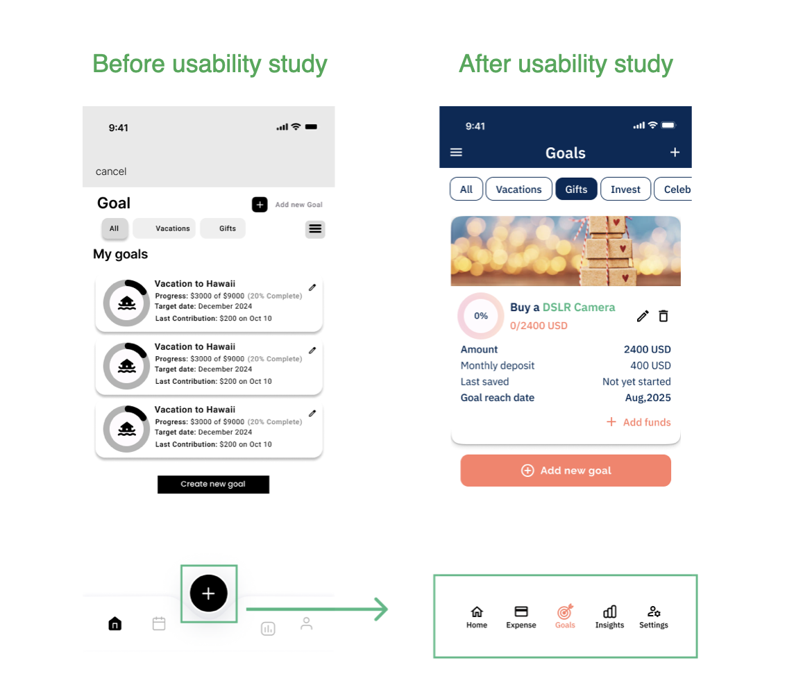
Participants were confused by the two buttons with overlapping functionality
Cluttered Card design
Users felt overwhelmed by the saving goal card design as it contained too much information in a small space.
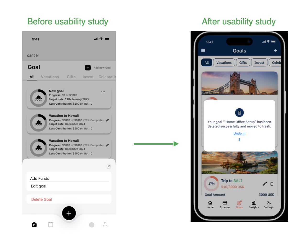
Confirmation messages
Users want a confirmation message when creating a goal and an alert or warning message before deleting a goal
Affinity Mapping
After completing my user research, I organized all the feedback and observations into an affinity diagram. By sorting the data into categories and tagging key themes, I was able to uncover patterns in user behavior, pain points, and needs. These insights played a key role in helping me refine my design and make more informed, user-centered decisions.

REFINING THE DESIGN
Usability Study
Changes
- Trigger a popup after clicking the delete button to give users a chance to reverse their action.
- Popup has an option to undo the delete, with a live 3-second countdown.
Benefits
- Improves usability and provides an opportunity to correct errors.
- Adds accessible feedback while enhancing the visual clarity and overall user control within the interface.
Changes
- Streamlined Navigation: Removed the confusing ”+” button and implemented a more intuitive, user-friendly navigation system to enhance usability and ensure seamless page transitions.
Benefits
- Remove a confusion point for users and make navigation between screens easier.
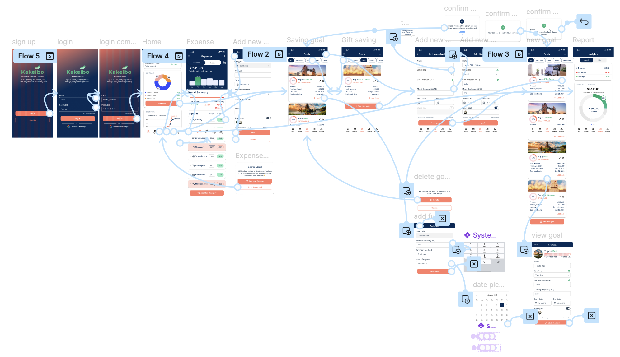
High Fidelity Prototype
As I transitioned into the high-fidelity prototype, I focused on bringing consistency, polish, and functionality to the overall experience. I created a design system with reusable components to maintain visual consistency and improve efficiency during iterations.
Using advanced Figma features like interactive components, smart animate, and variant-based prototyping, I was able to simulate real user flows and microinteractions with precision. I also incorporated Google’s Material Design icons to maintain familiarity and enhance accessibility.
This stage brought the product to life—visually and functionally—while staying grounded in user needs and feedback gathered throughout the process.
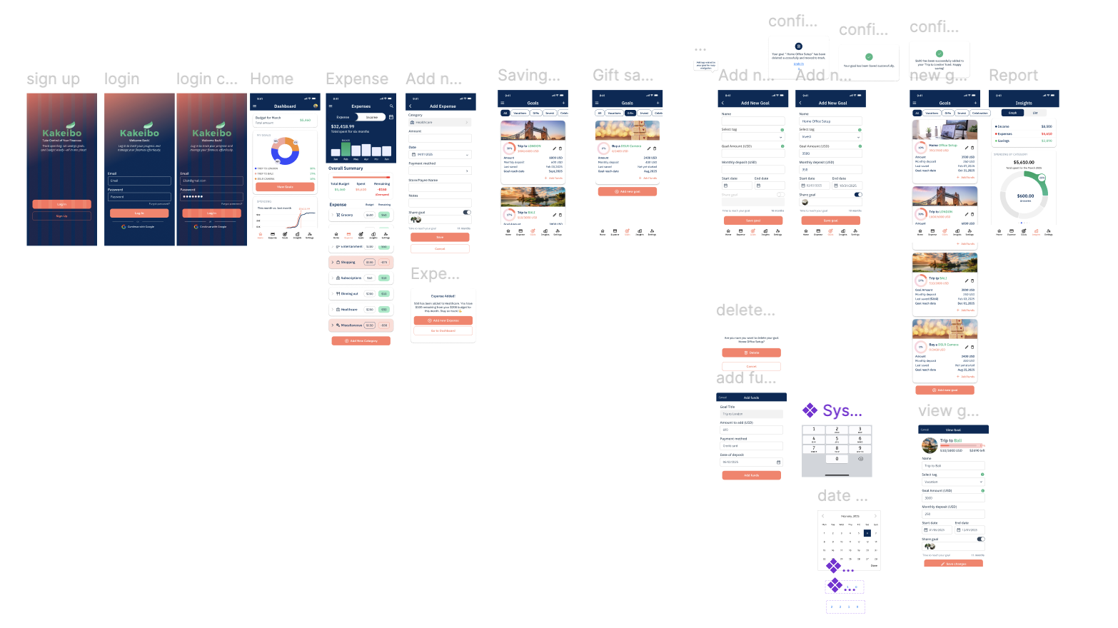
High Fidelity Mockups
Accessibility
Accessible Colors
I ran my colors through the color interface tool in Google’s Material Resources and made sure that all my colors were AA to AAA accessible.
Accessible Sizes
I made sure that my text, buttons and icons were of an appropriate size to be easily legible, no matter upon what screen size a user was viewing and using the site.
GOING FORWARD
Impact
The response to my design was overwhelmingly positive. Friends and peers complimented the app, and many even requested that I develop it further. One comment that stood out to me was: “I don’t use budgeting apps, but seeing your design makes me feel like this would actually help me manage my money and saving goals.” Hearing this made me realize the real impact of my work. It showed me that good design isn’t just about looks or features—it’s about creating something that resonates with people and makes their lives easier.
What I learned
This project was more than just a design challenge—it was an opportunity to truly understand people and their struggles with managing money. Through user research, I listened to real stories, frustrations, and needs, shaping my design around what would genuinely help them. One of the biggest lessons I learned was that research is just the beginning. Applying those insights thoughtfully and designing with empathy is what turns an idea into something meaningful. People know what they want—we just need to figure out how to offer it in the most efficient and intuitive way possible.
Next Steps
- Obtain UX/UI feedback from experienced designers to identify areas for improvement and enhance the overall design quality.
- Document and implement feedback to make meaningful design updates that improve the app’s overall user experience.
- Design a responsive website as the next step toward creating a cross-platform experience, ensuring consistent usability across all devices for cross-functional use.
Let’s Connect!
Thanks for checking out my work! I’m always excited to meet new people, share ideas, and explore creative opportunities.
Let’s create something awesome together! 💡🌈